
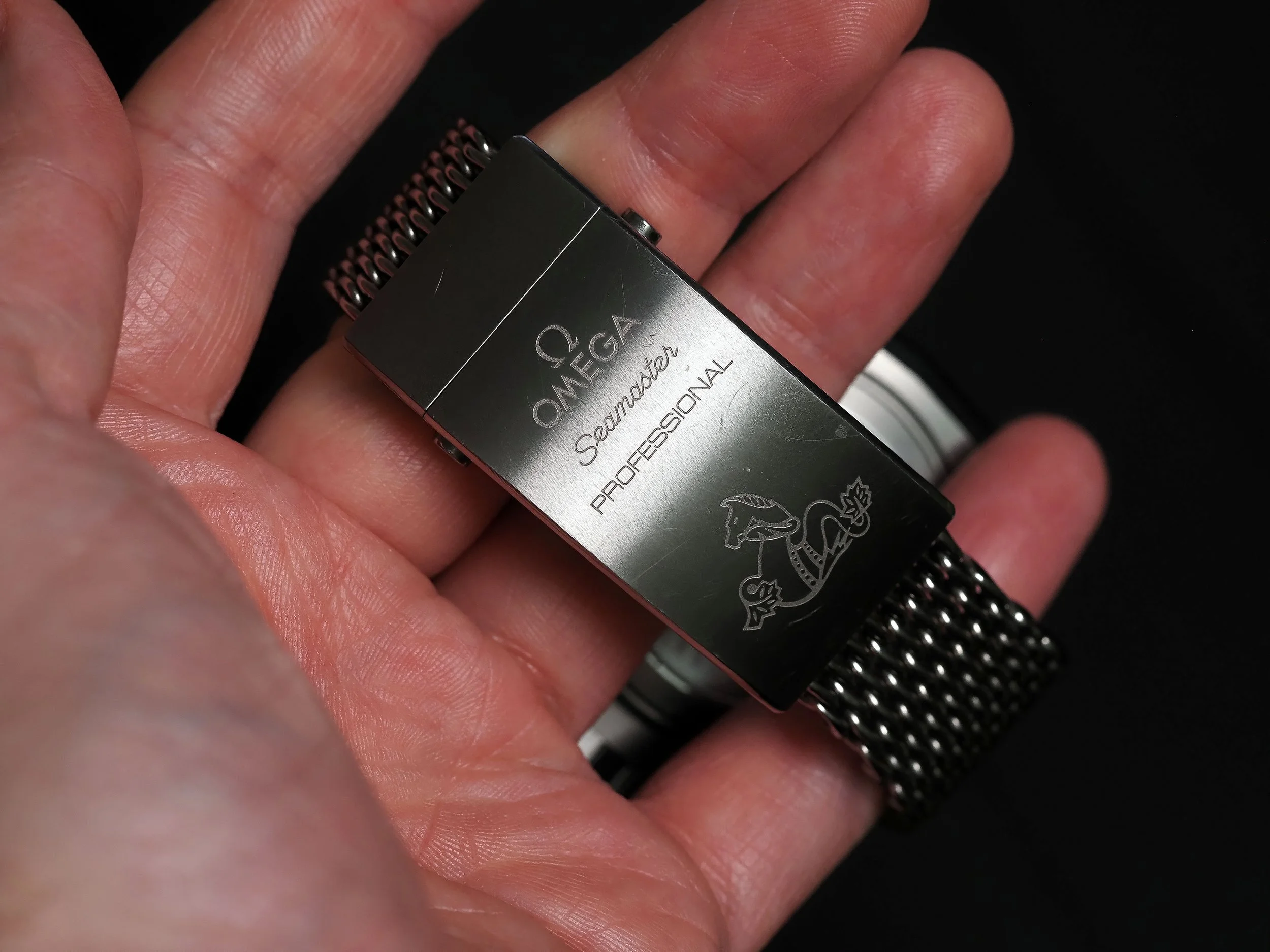
Seamaster PLOPROF 1200M a review.
The strange and beastly Watch
The Omega Ploprof
Design lost to time.
The watch industry is full of watches, many plain designs, derivative designs, designs so good they barely changed since their introduction and the watches that are all slight variations on classics. The Ploprof harkens from a time when technology was limited and when watches were functional tools. To understand the Ploprof (Plongeur Professionnel, the French for professional diver, and abbreviated with the first few letters of each word PLO and PROF), we need to understand its history and the constraints of the time period.
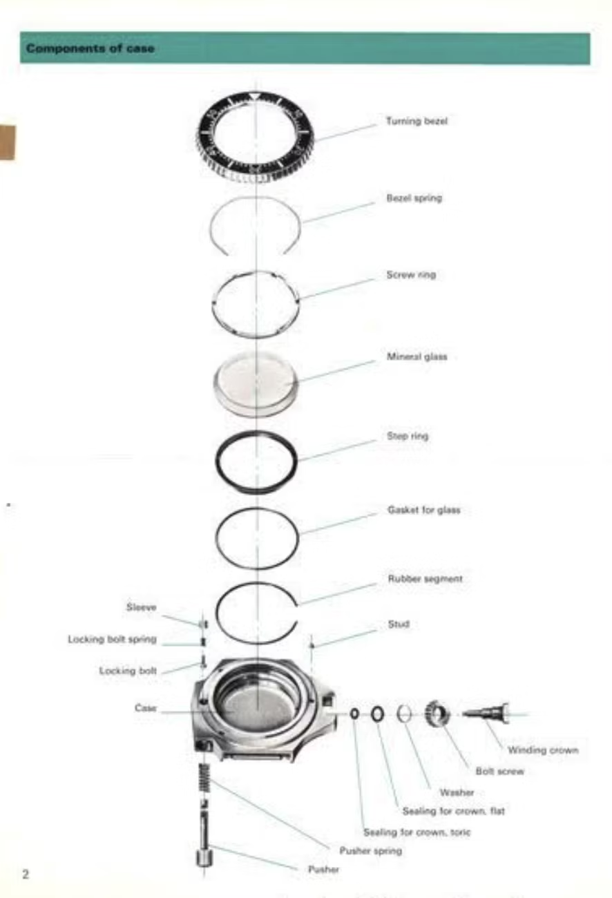
Exploded view of the case components of the original Seamaster ‘Ploprof’
The Ploprof is a dive watch from the time when deep sea environments and saturation diving was an emerging field. The mechanical watch, at this time, was a mission critical tool that divers relied on to visualize their oxygen reserves. In saturation diving, which is a form of diving that is hallmarked by deeper depth, diving bells and underwater environments where divers may live for the duration of their mission, the environment is under so much pressure that the divers need to breathe a mixture of helium and oxygen (heliox). The special gas mixture is because nitrogen, at high pressures, diffuses through your tissue and causes nitrogen narcosis (a condition which is extremely inebriating and causes disorientation and inability to think clearly or at all), which obviously means compressed air which a diver may use at shallow depth is not an option for the highest pressures. Helium does not have this narcotic effect, so it’s mixed with oxygen and pumped into dive bells and dive habitats. Helium, is the second smallest element and our divers of yesteryear are now sharing a space with helium under high pressure. The small atomic size of helium, combined with a high pressure environment meant that it could get between the, normally air-tight, gaskets of early dive watches. This would cause issues, as you could imagine, an example is during decompression the crystal or watch may pop apart since the inside of the watch was pressurized with helium. And thus, an issue presented itself for the watches (an important instrument back then) of saturation diving. They were no longer safe in pressurized environments combined with heliox. Since we are now looking back at history, we know that companies (Rolex and DOXA) developed the helium escape valve, a one way pressure relief valve, to prevent dive watches from popping apart. The HEV made its debut in 1969 (and the Ploprof in 1970) and while DOXA did co-create it, a pushy Rolex ended up with the subsequent patent.
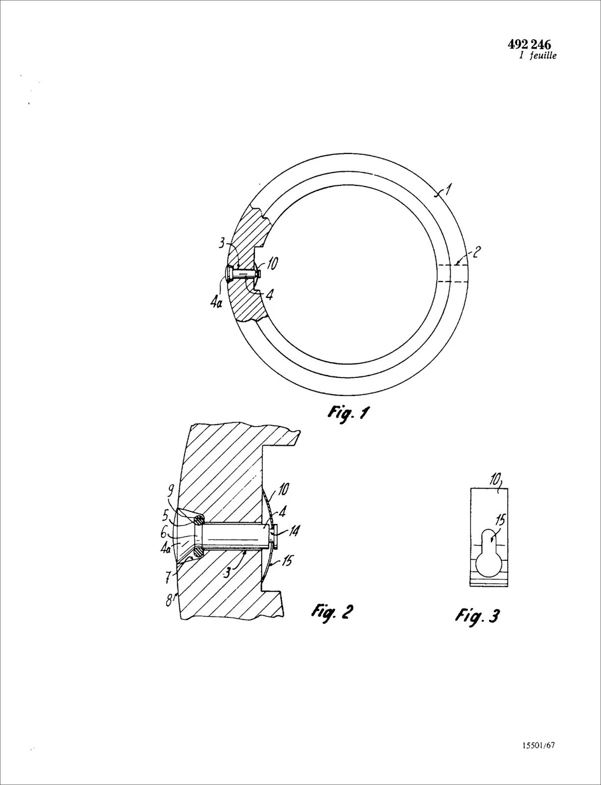
Rolex Helium Escape Valve
A page from the original patent for the HEV. You can see how a spring keeps it closed against the case (10) which gets pushed open when the pressure differential is high enough.
This meant that Omega (who was prototyping this for more than a year) had to yield to Rolex’s patent on the HEV, but the beastly Ploprof didn’t need some fangled pressure relief valve. These watches needed to withstand not only very high atmospheric pressures, but also withstand or resist helium ingress or the pressure differential inside the watch once you decompressed. To combat this the original Ploprof was machined from stainless steel and had a monocoque case construction, this means there was no caseback, the case was a single block of steel and the movement was loaded through the crystal aperture. A technique used to increase the rigidity of the case and reduce the points of ingress and egress for gases and liquids. High pressure causes deflection and flexure of watches, generally in the center, which means things like crystals and casebacks will flare out and the gasket seating will become compromised. Rigidity is important for reducing this. Next the crystal and crown need to be tackled. For the crown, they used a screw down locking mechanism. It’s a bit different from the screw down crowns of today, a nut screws in (or out) the square crown, which locked it into place. There were a series of washers and gaskets which were compressed and created a redundant waterproofing system, which today we see multiple redundancies on advanced crown and tubes. The crystal is more fun. They knew that helium would bypass the gasket no matter what they did, but they also had to make a watch water resistant to great depth. They used a massively thick crystal and a big gasket, then, on top of that, a screw down ring compressed and locked the crystal into place and ensuring engagement with the gasket (as well as driving the rest of the watch components into alignment). This way, in the instance of a case popping pressure incident, the crown is locked and the crystal is locked. The inside of the watch will still remain pressurized, but unscrewing the crown or simply letting it sit would allow it to attenuate, albeit more slowly. And thus, the beastly Ploprof was created. A watch milled from a giant block of steel, with a specialized crown lock and a hefty, stepped crystal with its on steel washer-bolt to keep it locked down. The bezel is thick and easily manipulated through a wet or dry suit, many dive watches featured a unidirectional ratcheting bezel (this way your dive could only be shortened and not accidentally extended) but the Ploprof created a redundant lock for the bezel. It’s bidirectional, but it’s only operational when the large bezel lock button is completely depressed. It’s a 2 hand operation and the chance of some sort of accidental bump that could somehow compress the button and turn the bezel is virtually zero. From necessity rises function and from functionality rises design. The Ploprof is a hulking, Millenium Falcon shaped watch that is meant for great depths, saturation diving, and easy operation with a neoprene coated hand. There is something very cool about the brutal design of it, which, it is certainly polarizing in the sea of watches we’re exposed to today, but that’s because the Ploprof was shaped through a gauntlet of unique demands. So how does the modern one stack up?
Cross section diagrams of the original Ploprof.
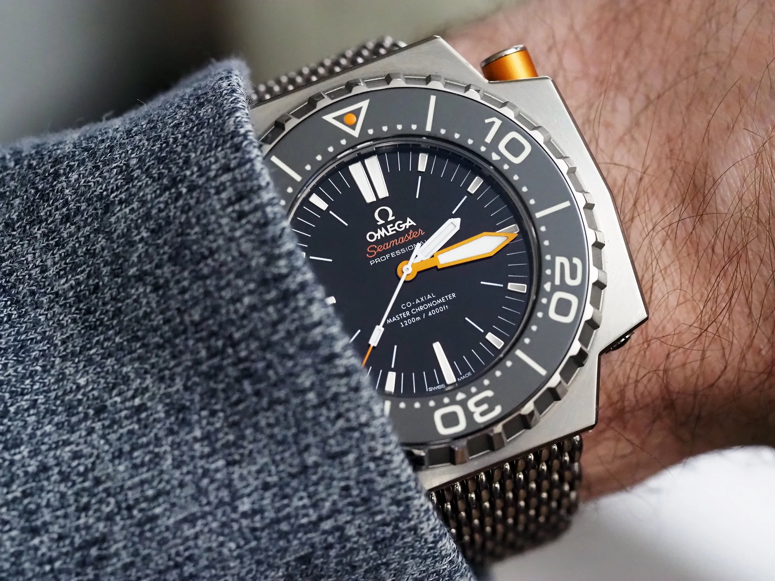
I was fortunate enough to snag a display model for 70% off of MSRP. The newer versions were made in steel and titanium, this is the titanium version. Even though my wrists are tiny, as a watch enthusiast and watchmaker interested in the evolution of dive watches, I’d always wanted a Ploprof but kind of resigned to it being out of budget. The MSRP on this one is in the ballpark of $12,000 (upon looking, the remaining inventory is now priced at $13,800), which I personally believe to be a bit too much. Though, perhaps the reasons that make me feel that way wont be as important to you, regardless, this version is now discontinued and has been replaced with one that draws more from the original - with the exception of a strangely awful blue colorway, this would have been a cool watch in the traditional colors. Lets explore what’s working and what isn’t. When I think of a watch, I break it into its respective components, each has value and interplay that contribute to the whole picture and value. Those components are: the case, the dial & hands, the movement, and the bracelet. I consider each on its grade or quality which is derived from how it’s manufactured, as different manufacturing techniques have goals and constraints.
DIAL & HANDS
The dial, hands and bezel are some of my favorite things about this watch. While I’m not entirely sure if this dial is made of ceramic, (Omega did produce many ceramic dials) it matches the luster and tone of the ceramic bezel insert perfectly. This creates a virtually seamless flow from dial to bezel, when the materials are the same, the way they reflect light is very harmonious, this unifies the watch in a more subtle but tasty way. The diamond cut and applied Omega and logo sit glistening atop the already polished dial, capturing photons and your attention. While the logo and Omega text are diamond cut and flat, this creates a uniformly reflective plane that captures light in a distinct way, the indices, unfortunately are not manufactured this way. Each indice, while supporting Omega’s impressive lume, is likely stamped then hand polished as they all have rounded edges. The round edges of the indices reflect light much differently than the flat diamond cut of the logo and reduce the design cohesion through small elements like this. Having flat diamond cut indices may give the watch more “bling” factor, as the rounded profiles soften the reflections, it also feels like a choice that doesn’t have a very good explanation as to why. I would have preferred all the indices to match the logo in the flat diamond cut, just as the ceramic (presumably) dial and bezel insert match, these elements matching would be a very nice touch.

Onto the hands and colors. The hand set is mostly in keeping with the original, though the hour hand is painted and the minute hand is lightly blasted metal which is then ion plated orange. The seconds hand is again painted, with a painted orange tip. Obviously, orange is the accent color here and we see it in the hand set, the dial’s Seamaster text, the orange pip on the bezel insert and finally, the bezel lock button. This is another unfortunate design cohesion miss. In the world of colors, an opaque paint will never match an ion plated metal, just by virtue of how light and pigments work. This means that the minute hand stands out as being a different shade from the painted tip of seconds hand, the bezel pip, and the printed Seamaster text. While the same color code could have been chosen, the result will never be a clean match, even the bezel lock button which is also an ion plated metal appears a slightly darker shade than the hand. While the button and hand are likely the same ion plating color, the flat and reflective nature of how the minute hand was made makes it appear lighter. Next up we have the painted and printed orange elements. For some reason, the Seamaster text on the dial appears darker and slightly more red than the tip of the seconds hand and the bezel pip. I can’t say for sure if it’s actually a different color or an optical illusion elicited by the contrast of the black dial and the slightly different shade of orange from the minute hand, but the result is a mish-mash of oranges tones where the only clear match is between the painted tip of the seconds hand and the center of the bezel insert pip. The theme with the Ploprof seems to be a miss with some of the details that unify a design and make it exceptional, especially at MSRP where you expect these things to be noted. I can understand wanting a raw plated metal look for the minute hand, but one of my pet peeves is slightly mismatched colors or when people use red and orange within the same color theme, it just doesn’t work. If the color matching was better and the indices were the flat diamond cut like the logo, the Ploprof would have a much more fierce and stated design and that’s with only a few very small changes. The lume on the dial, hands, and insert is exceptional and bright, as you would expect from a watch of this caliber; while I’m not a lume fiend I do enjoy the moments when this watch is absolutely glowing.
CASE AND BRACELET
The Ploprof has a reputation for being huge and generally unwearable unless you have Hulk sized arms. While it is certainly a substantial watch, most of its heft comes in at how wide it is (remember it’s asymmetrical with a large crown and guard) and its thickness. The secret in the Ploprof’s wearability is the fact that underneath it’s weapon-esque design, it’s a cushion case. The mounting for the strap is recessed further into the case and the result is a “lug to lug” (it’s lugless but you know what I mean) length that is virtually the same as a Rolex Datejust or the Omega Globemaster, two watches that are synonymous with being very wearable and very much in the middle of the road in terms of dimensions. Speaking of optical illusions, this is probably the greatest optical illusion of the watch, hearing that it has the same lug to lug as a Datejust seems rather inconceivable, until you either put the watches side by side or mount the Ploprof on your wrist. It certainly dominates that space, but not in a way that it’s particularly unwearable. Though, the only long sleeves I’d wear it with are the long sleeves of a wetsuit as its abject thickness will be an absolute impasse for sleeves.
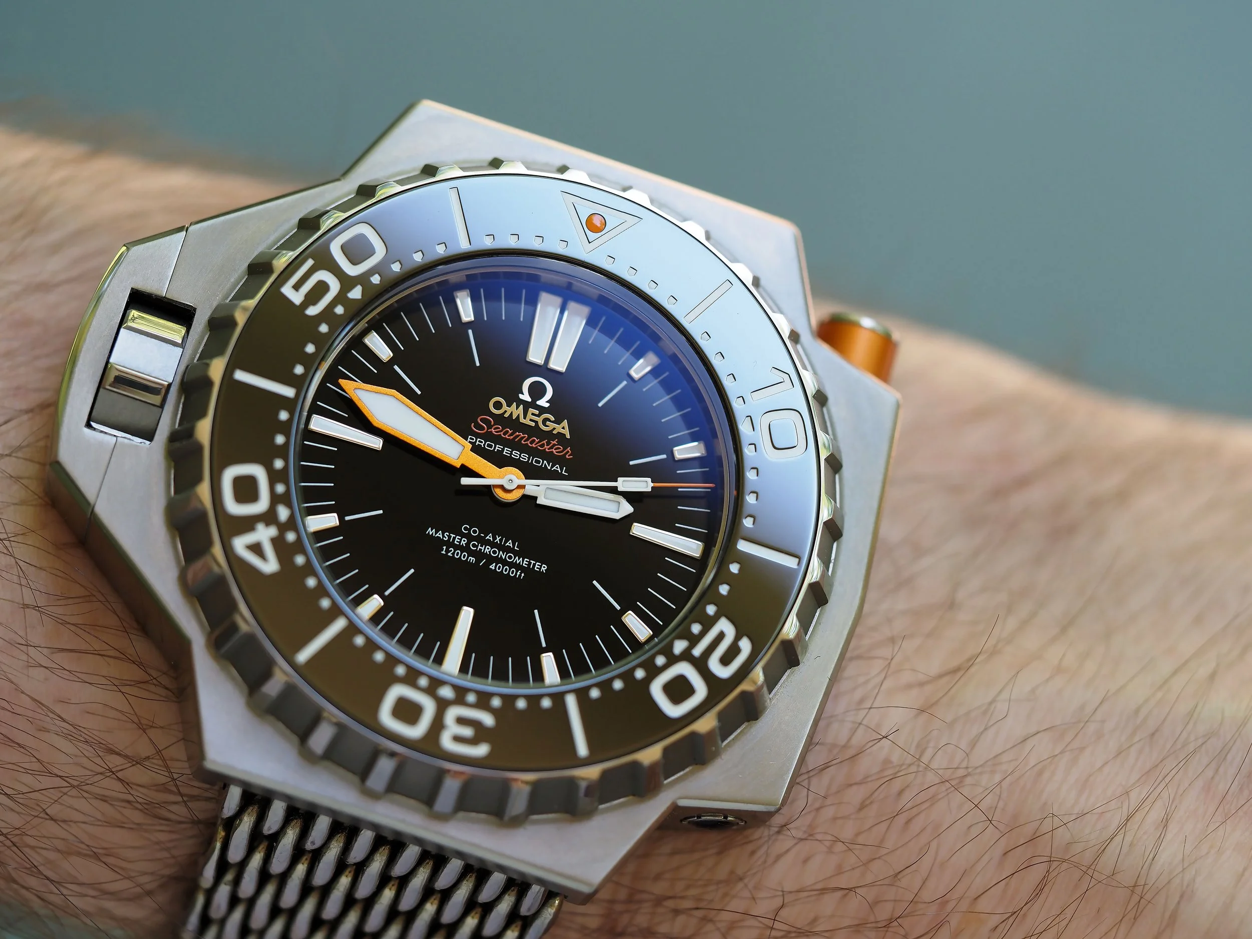
The weight is another point of contention, with the titanium version it certainly becomes manageable - it’s a little shocking as the titanium tricks your expectations upon first holding the watch. The stainless steel version is very much the opposite, it’s a heavy, and noticeably so, watch. Which for a watch that’s already peculiar, polarizing, and fraught with stereotypes/misconceptions, the steel version definitely adds weight into the list of things that would make it “a watch for people with Hulk wrists”. Titanium makes it much more wearable and I do personally enjoy the soft hue of titanium in this execution. Speaking of execution, however, case finishing is another point of oversight. The Ploprof’s case features light circular brushing on the top face of it, with vertical brushing on the flanks. The bevel on the top face is also polished, though not in a particularly impressive manner. Another upsetting point of detail loss is this polished bevel. The crown guard continues the bevel of the case but it appears that during manufacturing their polishing process was to work through the mid-cases as a batch then polish the crown guards as their own batch, then assign a crown guard to a case. Why does this matter? With a design like this, if the bevels of the crown guard and case are not cut at the same time, and with the crown guard mounted to the case, they wont match. The angle, the depth, it’s mismatched and the polished line that circumnavigates the case is abruptly broken when it confronts the crown guard which has a bevel that’s a different angle, depth, and does not match the bevel of the mid case. I’m not sure I’ve seen a single modern Ploprof where the bevels are paired. This is another very disappointing oversight, especially since the finishing isn’t complex or done to some exquisite level. It presents itself as an amateurish oversight which traded a small amount of polishing convenience at the factory for a rather glaring inconsistency. And again, I’ll bring up the new MSRP, which after taxes would be close to $15,000 USD. When you have brands like Grand Seiko making titanium watches sing in ways that were previously thought impossible - and for the most part at half the price, it makes you wonder what exactly Omega is charging for because I’ll tell you that it’s not the case finishing. The crown guard is also another disappointment, it’s paired to the crown and as you unscrew the crown it undocks from the case and presents a surplus of wobbly tolerance which deflates some of the muscles of this big bad watch. The crown guard is perhaps one of the more disappointing components of this watch, the tactility is loose and floppy when unscrewed and the finishing is such a glaring mismatch you have to wonder how it got okayed, but it did. If I were running Omega’s production/manufacturing, I certainly would ensure that things like the inconsistent bevel on the crown guard and the unimpressive tactility of it were rectified for a watch of this presumed caliber. It’s a big over-engineered watch that was designed to brute force the problems of yesteryear, with modern manufacturing materials and techniques, no parts of it should feel floppy and given the modern state of saturation diving this is still a luxury item - which means the finishing should be exceptional.
The case also features a HEV, which is kind of funny given the history of the watch. It also has a display caseback to show off the coaxial movement - and adds additional points of water ingress at the point of the caseback threads and crystal gasket. The thickness of the original design was in part due to a lack of modern materials and techniques, including the HEV, which begs the question - does the Ploprof still need to be so thick? Personally, I think the idea of the Ploprof made into a slimmer watch, while maintaining its aesthetic would be quite tantalizing. Sort of like a Safari modified Porsche. Is there something about its large and bulky disposition that evokes emotion? Absolutely, but we’ve introduced mechanisms where the thickness is no longer a functional aspect as much as it is a design choice.
The bracelet and clasp are surprising on this watch, the clasp is easily one of the best clasps I have ever encountered - and you’ll often find owners praising this clasp. It’s thick, thicker than my Calamity dive watch or even any of my Hellcats, which would make it unsuitable on a thinner watch, but the thick clasp of the Ploprof acts as a counterweight and makes sense. For all the hard angled edges of the watch, the clasp is very smooth. It feels good to touch and operate, the tactility is great and the on-the-fly microadjust works well to cinch the watch onto your wrist and readjust it to a neoprene wetsuit without fuss - more colloquially it’s great for letting your friends try it on, even with disparate wrist sizes. And if a ratcheting OTF adjustment isn’t enough, it also has a dive extension folded up within it. The whole system works flawlessly, but not only does it work flawlessly, it looks good and the tactility of it makes it enjoyable to operate. I suspect the person that designed the clasp, was not the person that designed the watch. The sharkmesh band is polished titanium which gives it good wrist feel. Most sharkmesh, while looking cool, in my experience becomes a hair pulling discomfort. The wide and polished links on this one banish the hair pulling and make it an absolute joy to wear - once you size it. Sizing is unceremonious and permanent. You’ll need to bust out the nippers and cut through the individually polished rows of titanium links until you’ve irreversibly sized it to your wrist. Which is fine, but it does feel wrong lopping off links on something so nice and I am a big fan of making things reversible. The bracelet pairs unceremoniously to the case with a springbar, which just feels a little rudimentary. If I designed, or redesigned this, another change I would maker here would be a machined titanium block or endlink with an integrated pushbutton release that fits seamlessly with the cutouts in the case. It’s an expensive watch without many design choices that screamed “above and beyond” but rather doing the bare minimum or “a little extra”. Machined integrated endlinks with a button release would be a very nice touch on this watch, working with the retro-futuristic aesthetic of space-chic and docking components. It would also be a premium feature on a watch that, to be honest, feels premium but doesn’t have any really stand out features (besides its unmistakable and polarizing design).
MOVEMENT
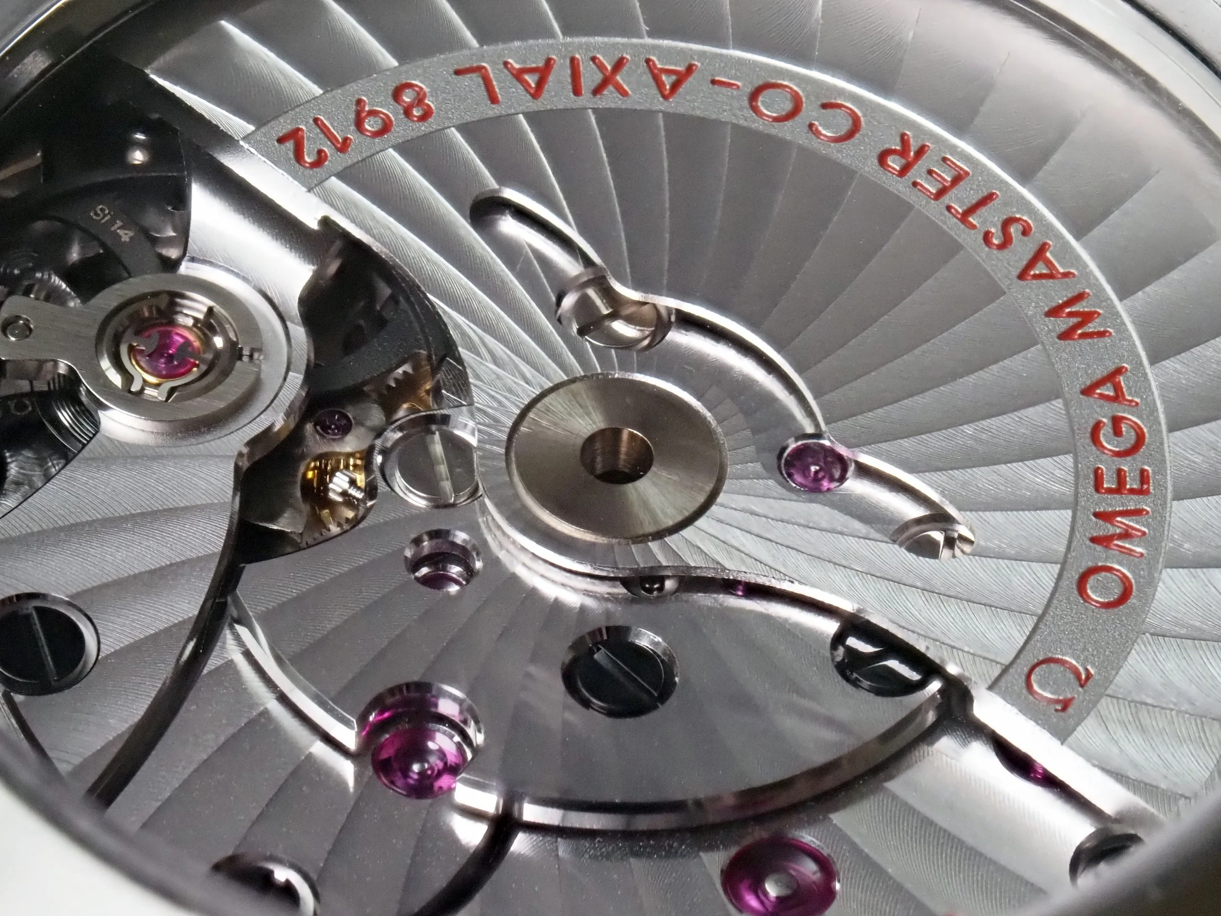
Omega Caliber 8912
With its supple and large jewels, sunburst côtes de Genève
Inside is the Caliber 8912, one of Omega’s coaxial movements with an independently set hour hand complication. It’s a nice dual barrel movement which in my ownership (of both the Globemaster and Ploprof) have never had any issues with. It looks nice and performs well, I do feel like the independently set hour hand is another kind of weird addition of like, “We have this complication, lets just use this movement as value added!” kind of mentality. It doesn’t make too much sense in the context of the watch, but it’s a nice complication to have which makes setting time slightly easier. My belief is that it’s a holdover from a GMT complication, so it makes changing the time convenient if you travel a lot. The movement is something that I wont comment much on, as Omega can serve you those details. It has good machine finishing, the overall design makes for a good look (I like the large jewels for the barrels), the magnetic resistance and silicon hairsprings make for great updates in everyday use. My only reservations would be with the black plated components and the traveling hour hand as additions that present points of failure. If any of the plated components start to fail or rub with other components, you’ll quickly have a lot of movement contamination necessitating a swift service. The hour hand, I can see the wheel that provides the hour jump failing prematurely if someone uses the complication in an excited or excessive fashion. Personally, I’ve not had such issues and the movements have only ever been reliable and accurate for me.
SUMMARY
The Ploprof is a standout watch and despite its handful of design and manufacturing oversights it achieves something, for better or for worse, that very few watches can achieve. It elicits emotions. Love it or hate it, it’s a watch that begs to be investigated and whether you’re reveling in the bizarre watch or lambasting it, it’s a watch that makes you stop and feel something. Which, to me, this is really the core of what watches are about, enjoying something and feeling some kind of excitement. There is something undeniable about its presence, and that undeniability is worth investigating and learning how to apply to other things.
How does it wear though? I have very small wrists and it’s definitely a big watch, but despite its chonkiness, it wears very well. Since it sits so high off your wrist, it does tend to smash into more walls, knobs and countertops, but my watch seems to not accumulate any meaningful scratches or dings, surprisingly. The left sided crown does reveal that they essentially rotated the movement and flipped a dial around, I find myself rotating the watch 180º to wind and set time since the crown functions are inverted when you operate it on the left, moving it so it’s oriented to the right makes it operable like a normal watch (perhaps another oversight? Should the movement have been redesigned to have an intuitive winding and setting train for LHD?). It’s a watch that certainly announces its presence, to you as you wear it and to others. With Orion, part of the design goal is to make watches that are ergonomic and don’t bother or nag your wrist, the Ploprof is the opposite of this. After a day of wearing it, it certainly lets you know that it’s time to take it off, whereas with an Orion you may forget that you’re wearing it (I do at least). The Seamaster is a strange watch and it certainly has its quirks, which as you know I’d revise, but it’s a watch that’s so unique and weird that is captures some kind of odd lightning in a bottle. I don’t think it makes a compelling argument at MSRP, but pre-owned or significantly discounted it’s easier to forgive some of the aforementioned quirks and oversights. It may be easier to hate than love, but it is a watch that nearly all watch-literati are familiar with and that’s saying something.